Test and Build for Mobile with Google Optimize

From buying new shoes to booking weekend getaways, mobile can make life more convenient for consumers — and create big wins for marketers. While 40% of consumers will leave a web page that takes longer than three seconds to load, 89% of people are likely to recommend a brand after a positive brand experience on mobile.1 That's why getting your mobile site in shape is more important than ever.
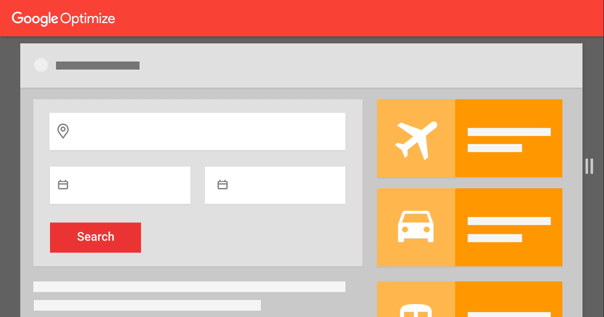
To create the seamless and responsive mobile site that consumers expect, you need the right tools, like Google Optimize. Optimize makes it easy to test different elements of your site to find the winning combination for the best mobile site possible. Now it’s even easier with our new responsive visual editor – and be sure to read on and learn how two of our clients found mobile success with Optimize 360, our enterprise version.
To create the seamless and responsive mobile site that consumers expect, you need the right tools, like Google Optimize. Optimize makes it easy to test different elements of your site to find the winning combination for the best mobile site possible. Now it’s even easier with our new responsive visual editor – and be sure to read on and learn how two of our clients found mobile success with Optimize 360, our enterprise version.
New! Preview your mobile site on any screen size
While almost everyone has a mobile device, there are so many variations and screen sizes that it’s hard to take a one-size-fits-all approach to optimizing your mobile site. Now, once you’ve created your test page, you can use the new responsive editor to immediately preview what it looks like on any screen size. Or, if you want to see how it appears on a specific device, like a Nexus 7 or iPad, we’ve added more devices that you can select to preview. Learn more about the visual editor here.
Turn ideas to tests quickly
The responsive visual editor in Optimize is just one solution to help marketers succeed on mobile. Our enterprise version, Optimize 360, makes it easy to make improvements to mobile sites efficiently and rapidly.Dutch airline carrier Transavia Airlines turned to Optimize 360 to try out different ideas on its mobile site. In fact, the team runs about 10 A/B tests each month on the site, all without having to spend significant time or effort. And the best part? Time spent on analyzing the success of site tests has fallen by 50%. This allows Transavia to focus more on testing to improve its mobile site. Learn more in the full case study.
The path to mobile excellence starts with the customer journey
Need some help determining what should test on your mobile site? Google Analytics 360 is a great place to start. You’ll be able to analyze any customer interaction, from search to checkout, to figure out which points of your purchase process need help. Then, once you’ve determined where your site needs work, using Optimize 360 to take action is simple, since it’s natively integrated with Analytics 360.This is exactly how fashion retailer Mango used Analytics 360 and Optimize 360 to tackle its mobile site: After discovering that mobile visits to its online store had skyrocketed 50% year over year, Mango decided to dig a little deeper. In Analytics 360 Mango discovered that while many consumers browsed product listing pages, few were taking the next step to add products to their shopping cart. To reduce steps to checkout, Mango used Optimize 360 to include an “Add” button to product listing pages. This increased the number of users adding products to their carts by 49%. Find out more in the full case study.
Ready to optimize your own mobile site?
Start testing new mobile experiences with the responsive visual editor in Optimize. This update is one that can help marketers do more on mobile — because whether it’s changing a button or fine-tuning a homepage with quick A/B tests, we’ve learned that small tweaks can make a big impact.And, if you haven’t already, sign up for a free Optimize account and give it a try.
1 Google / Purchased: "How Brand Experiences Inspire Consumer Action" April 2017. US Smartphone Owners 18+ = 2010, Brand Experiences = 17,726.